(01)
BACKGROUND
Like many Bulgarian brands conceived in the early 2000s, Orange, the largest bookstore chain in the country, had its entire identity revolving around a logo and a signature colour. So they approached us with a task. We needed to refresh and build upon the logo, crafting all the elements of a complete brand identity, fluid, digitally oriented and future-proof. At the same time, we had to stay true to the company’s heritage.
(02)
APPROACH & IDEA
Orange has always been more than just a bookstore.
We helped them put this feeling into words and crafted the new brand positioning, „Books. Gifts. Joy“, which was the starting point for the whole revamp.
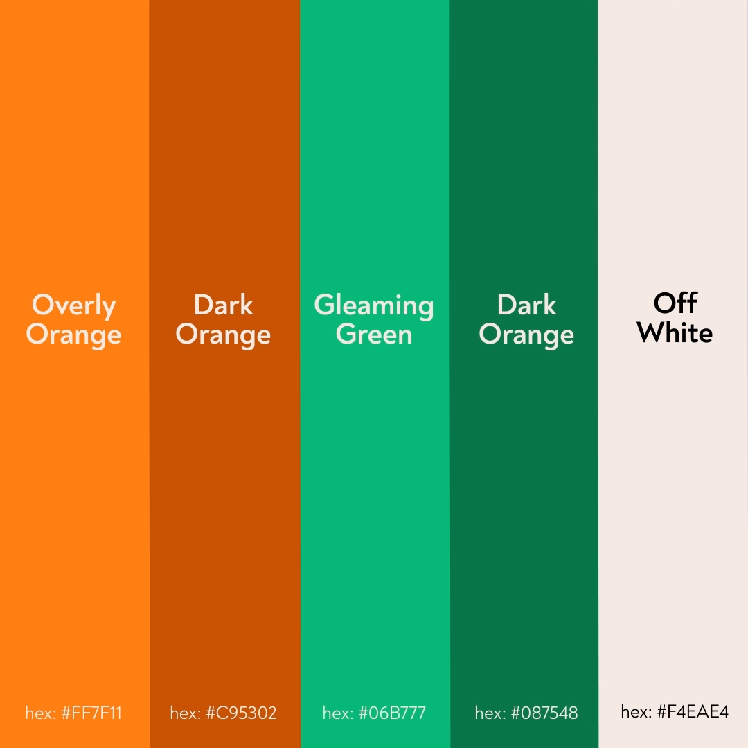
It was crucial to keep a visual familiarity with the old identity while adding much more to its visual background with elements, patterns, colours and a clear, unique tone of voice – none of which were firmly set before.

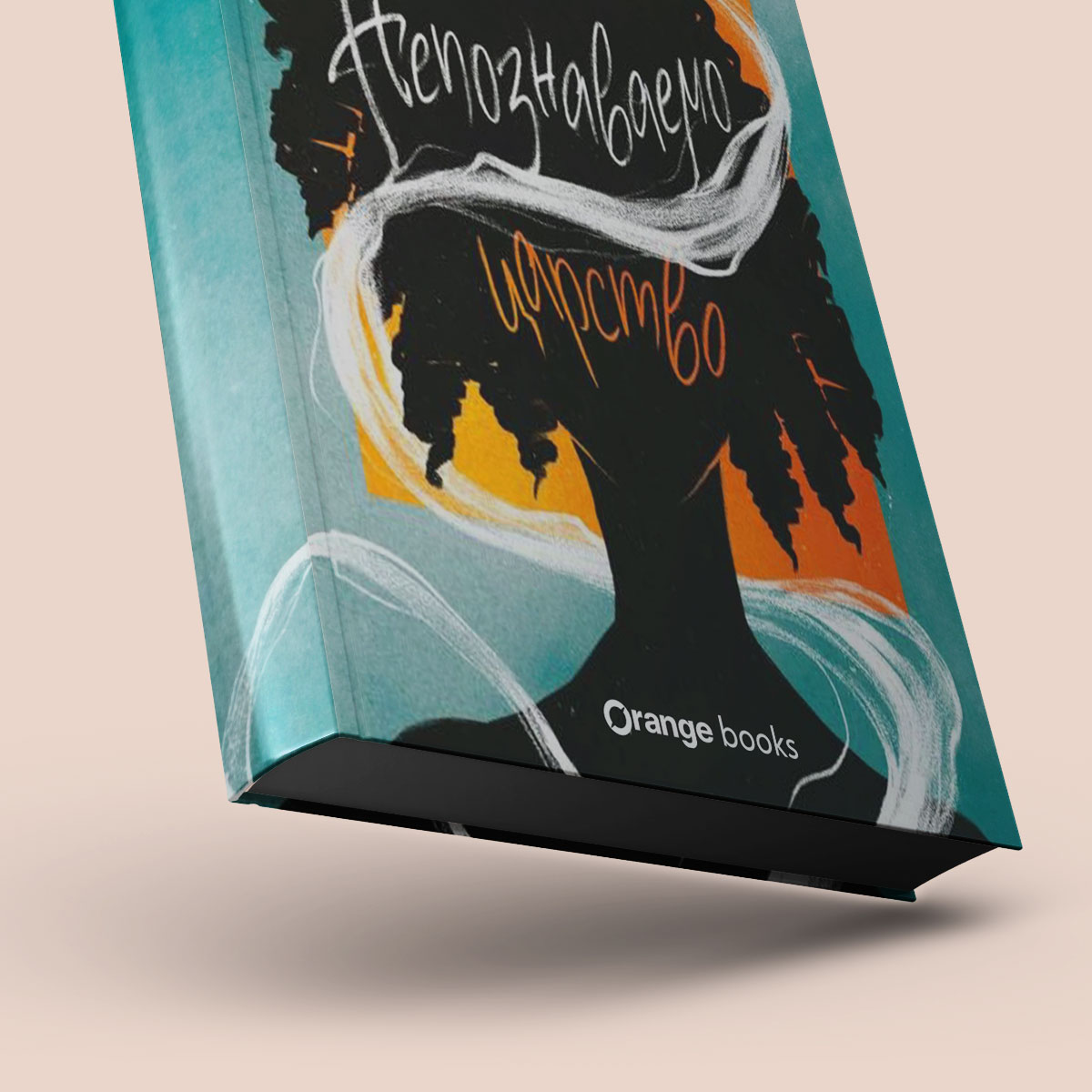
The most important book in Orange's bookstore
All of this was neatly placed into a 65-page brand book with high-quality physical copies.
(03)
EFFECT
The new brand positioning and identity were implemented throughout all physical stores and digital touchpoints. It served as the basis for Orange’s new mobile app and the new-look website, launched consecutively after the visual identity.


"We're incredible happy with how joyful and bright our brand looks. It's exactly what we imagined Orange should be represented by."
Niya Arsenieva
CEO, Orange


