Is it time to part ways with minimalism?
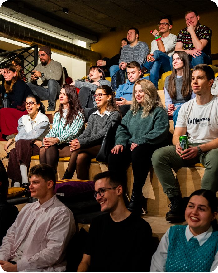
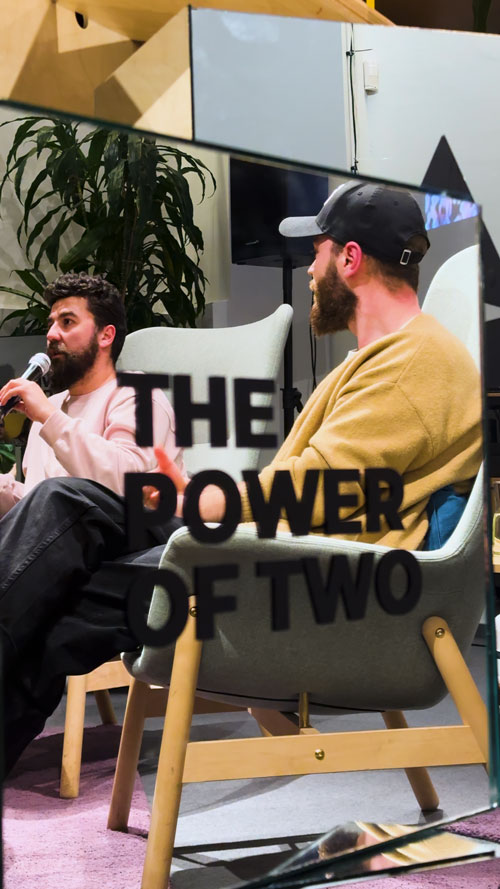
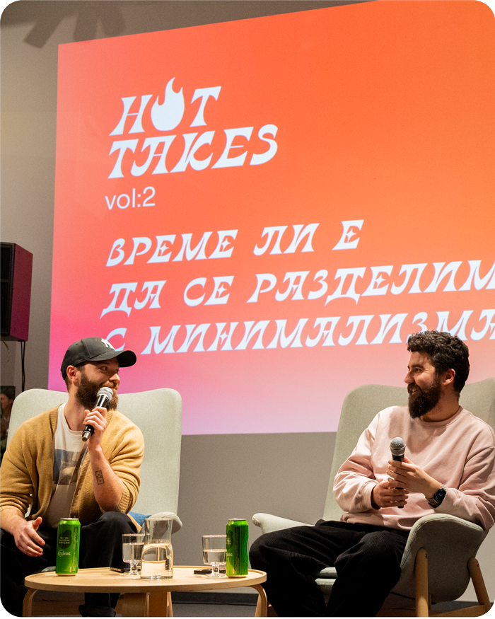
At our recent Hot Takes discussion, our Creative Directors & Co-Founders Ivan Totev and Dimitar S. Stefanov conducted a brief experiment, asking the audience what comes to mind when we mention some of the most famous brands: Animal Planet, Jaguar, Burberry, and others. Everyone immediately recalled the iconic logos they associate with these brands. To their surprise, these symbols are now almost unrecognisable, having lost the originality of their essence and taken on a nearly identical look.
We are witnessing a trend towards oversimplifying the identities of many brands. This is due to the need to use them on digital platforms, which sometimes strips them of their character.
Bulgaria’s Design Landscape
We’re used to associating Eastern European countries with excess, hyper-eclecticism, and ugliness. Whether it’s because of the Iron Curtain, followed by the chaotic and anarchic 90s, Bulgarian style is often associated with kitsch.
It could be an ad for a waffle brand that hasn’t changed its design in 30 years because it doesn’t realize there’s another way to represent itself, or because it believes consumers expect exactly that – over-the-top colours, loud packaging, overcrowded design, and inevitably the Balkan Mountains in the background.
Or a neighbourhood deli with a single poster announcing its name, the fact that it sells meat, but, quite casually, that it also owns a hotel in a nearby village. Classic.
The constant shift between styles
We’ve witnessed a complete transformation of the Balkan retro-socialist style into millennial grey. The children of the over-the-top hoarders (meaning our grandparents with fifty ceramic figurines on display) wanted to erase any trace of grandiose chic. And we filled our homes with Instagram asceticism.
But as we’ve seen in the change of well-known brand logos, greyness and uniformity lead to identity loss. Perhaps we have already reached the threshold of minimalism. The time has come to embrace complexity in Brand Design.
Could kitsch be an inspiration for modern design?
Like everything in nature, times change, and styles revolve. Reductionism as a trend robs us of the richness of imagination.
We believe it’s time to draw inspiration from the ugly, from kitsch. Kitsch is everything that seems like too much, but you can never accuse it of lacking inventiveness. Kitsch gives you the freedom to be completely free in what you do. To surprise, to impress. To push it. To go too far.
For a design to stand out, it must have its own character, not imitate. To possess its own authenticity. More elements mean more engagement across diverse platforms.
Brands now have to exist in a permanent state of motion
The counter-trend to simplification is that all brands need to move, and move a lot, because they are increasingly present on screens, which forces the identities themselves to contain many different elements.
Motion is fluid and adaptable. Branding is inherently about consistency and repetition. You’d be right in thinking that these two factors are naturally at odds – and now, we’re in need of new expertise to bridge the gap.
Moving from “less is more” to “more is more”
We’ve already seen the result of minimalism on branding. If at some point it was needed and it worked, that moment is over now. Less is no longer “more”. The authenticity and richness of Bulgarian culture is an inspiration for diversity and experimentation.
And about the future of branding? It needs movement. Fluidity. Life.
It needs more. We need to set aside the conventional norms of design creation and let go.
Until the next trend.
